Style Guide
This style guide is designed to help our real estate agents create business cards, brochures, and other marketing materials that consistently reflect the Burt Ladner Real Estate brand. Below, you’ll find approved colors, typography, and logos that ensure every piece you produce looks polished, professional, and unmistakably ours. Use this guide as a reference whenever you create new materials to keep our brand cohesive and instantly recognizable across every platform.
Fonts
Burt Ladner Real Estate uses two main fonts in print material like business cards, marketing brochures, and signs, Borgia Pro Regular and Helvetica.
Borgia Pro Regular
A B C D E F G H I J K L M N O P Q R S T U V W X Y Z
a b c d e f g h i j k l m n o p q r s t u v w x y z
1 2 3 4 5 6 7 8 9 0
Helvetica
A B C D E F G H I J K L M N O P Q R S T U V W X Y Z
a b c d e f g h i j k l m n o p q r s t u v w x y z
1 2 3 4 5 6 7 8 9 0
Colors
Primary Color
4-Color Print (CMYK): C:64 M:85 Y:42 K:34
RGB: R:87 G:48 B:80
HEX: #573050
Plum is a rich, sophisticated color that anchors the brand with depth and confidence. It conveys professionalism, stability, and understated elegance, making it well suited for real estate marketing where trust and refinement matter. Use this color for primary accents, headings, and key visual elements to add warmth and distinction without overpowering supporting colors.
Secondary Color
4-Color Print (CMYK): C:52 M:16 Y:93 K:01
RGB: R:137 G:172 B:72
HEX: #89AC48
Green is a fresh, natural color that represents growth, balance, and opportunity. It adds an inviting, optimistic tone to our brand and works especially well for real estate marketing by evoking a sense of land, livability, and long-term value. Use this color as an accent for calls to action, highlights, or supporting elements to introduce energy and approachability while maintaining a professional look.
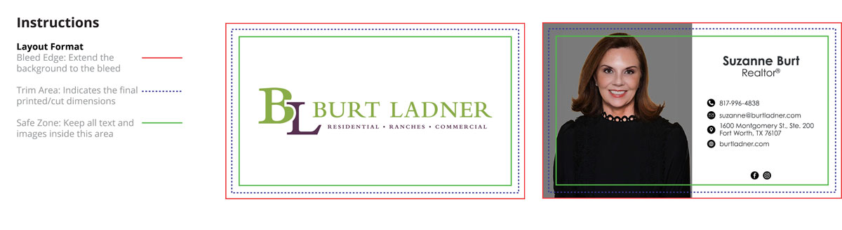
Business Cards
Approved business card formats are meant to give agents flexibility while keeping the overall look cohesive and professional. Both horizontal and vertical layouts are welcome, as long as approved colors, fonts, and logo treatments are used. Clean, simple designs that clearly present names, titles, and contact details work best and help ensure every card feels like a natural extension of the Burt Ladner Real Estate brand.